Case 1
Notification and productivity workflows
Case 1
Notification and productivity workflows
GitLab currently sends most notifications about most platform-related activity via email, with only a small subset visible in the UI. How can we make our notification system more flexible, so that people can receive only the notifications they want, where they want them?
GitLab has two separate notification systems.
One system, linked to a person's email address, offers the possibility to receive updates for any activities that happen within the product. People have the ability to adjust the level of notifications they receive in this system.
The other system surfaces "actionable" notifications within GitLab, on a "To-Do List". People currently have no ability to control which notifications they receive on this To-Do List. Further, only a small subset of notifications are available to people on this list, so there is no way that someone could view notifications for all activity within GitLab on this list, even if they wanted to.
Note that what follows is my current project, so everything is still very much in-progress. I plan to update this case study as our work progresses. Also, in case you prefer video content to text, there is a YouTube recording of a presentation I gave on problems we're trying to solve with this effort.
I'm grateful to be working with a very data-focused PM on this project.
Before I even started on the team, he had done a ton of groundwork in terms of understanding the data on how people were using the existing notification list in the UI, which we refer to as a To-Do List. He discovered that, while internal adoption of the To-Do List is quite high, our customer adoption and retention numbers on this page are particularly low. These numbers led him to suspect that our To-Do List design was pushing customers out of GitLab, and forcing them to rely on their email inboxes.
To better understand the "why" behind these usage numbers, and to understand the deeper pain points and needs around notifications, the team started conducting interviews with users.
After talking to people, we discovered that customers don't want to have to rely on their emails to keep up-to-date about what's happening within GitLab, but they currently feel that they have to, because they are otherwise afraid of missing important updates. They feel stuck in this less-than-optimal situation, since they have no control over which notifications show up on their To-Do List. They are instead getting a sometimes overwhelming number of notifications to their email inboxes, and are forced to triage their inboxes to see which of the notifications require follow-up.
What were were hearing from customers, loud and clear, was that they wanted to be able to control which notifications showed up in the UI, and they wanted to be able to trust that, by using the UI list, they wouldn't be missing any important information.
Having notifications in the UI also makes sense from a workflow efficiency point of view. If customers are receiving notifications within the tool they will action those notifications in, we're removing the need for them to jump between tools to complete their tasks.
This idea was validated in our interviews, as well. As one customer said, "If I could have the same kind of notification system within GitLab, that would be perfect. If there is a notification about a ticket, you stay in the same environment. No need to switch from one tool to another."
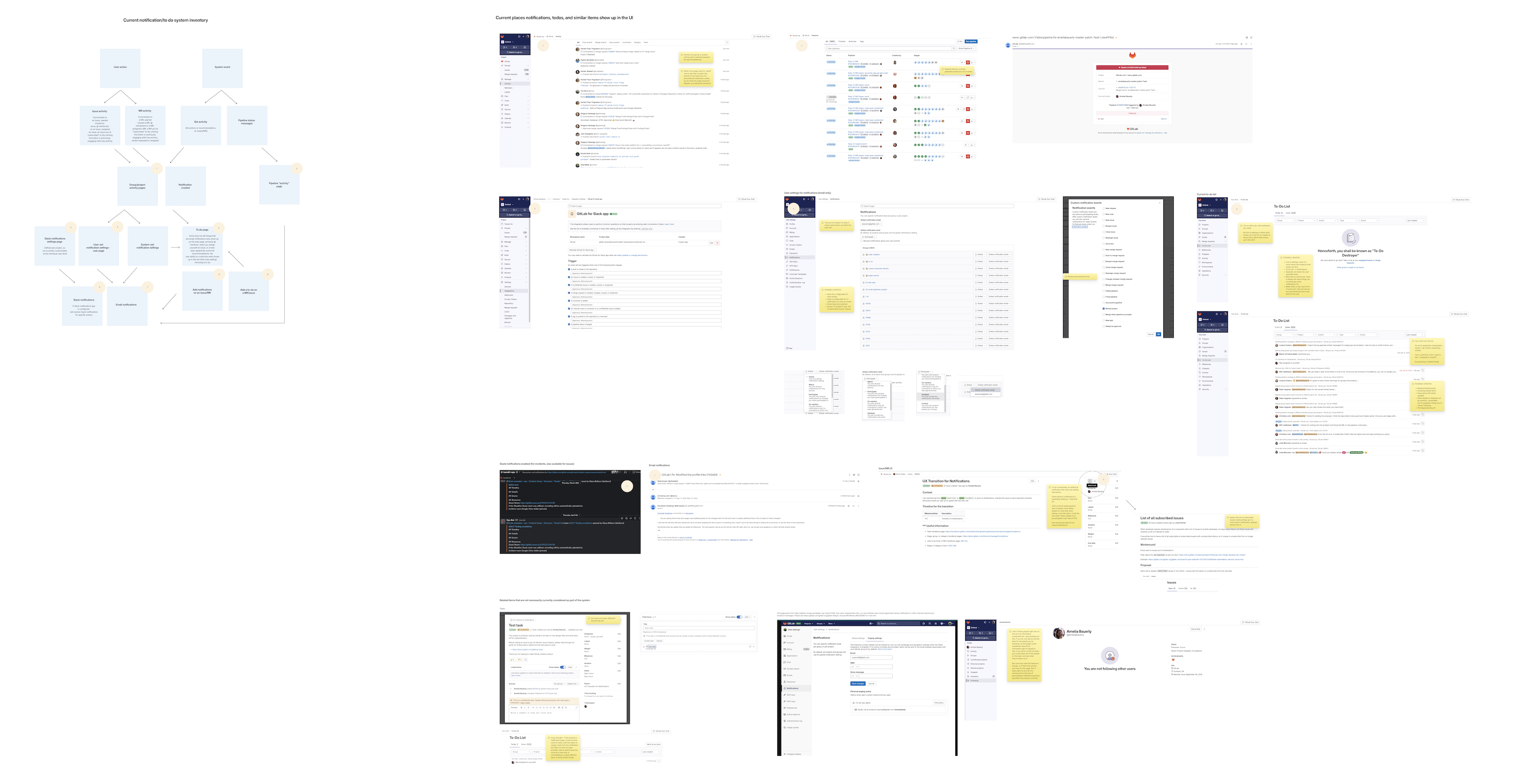
With this feedback in hand, I completed a UX Scorecard to assess the current experience. I also started a design discovery process. My first step was to create an inventory of the current notification system, and of the To-Do List experience. That looked like this:

Using this inventory of our current system, I isolated four key touchpoints we'd need to consider as we reworked this notification system:

I then used these touchpoints to start sketching out what some of the impacted pages in GitLab might look like, in future. These sketches were very low-fidelity, but pointed towards the kinds of improvements we'd need to make in order to improve the experience in the ways customers were requesting:


You'll probably note the many yellow sticky notes in the designs: They were primarily outstanding questions we needed to resolve. At this point in the process, there were many! But what we were slowly putting together was a rough vision for what a new notification experience/workflow within GitLab might look like.
What we were imagining was a fully-functional notification center within GitLab. But, is that what people wanted and needed?
I put my rough sketches into a quick prototype and created a public feedback issue for designers and other people within the company to give their feedback. I wanted to know how they felt about the sketches so far. I also wanted to know if there was anything important that they expected to see in the sketches that they didn't, or if they spotted anything that was particularly worrisome in what I'd described thus far.
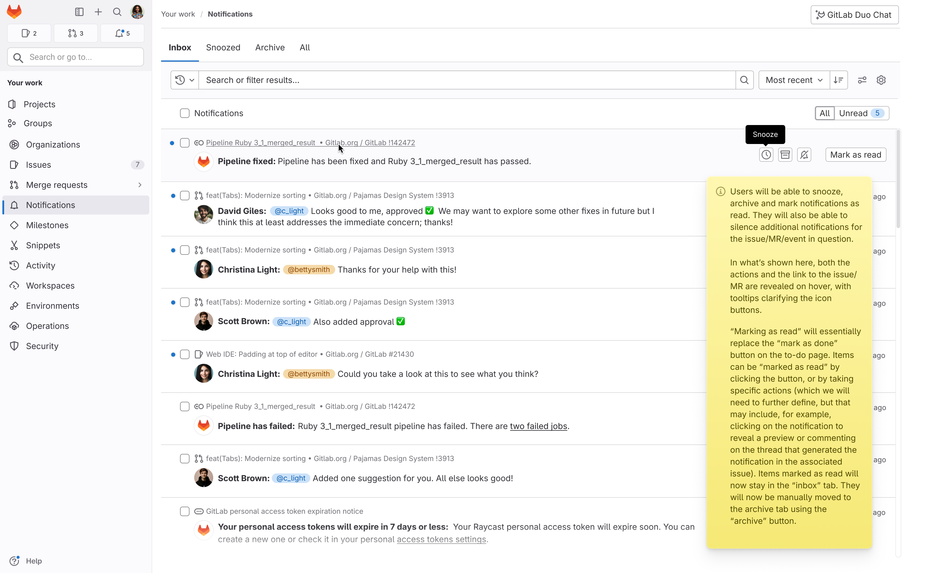
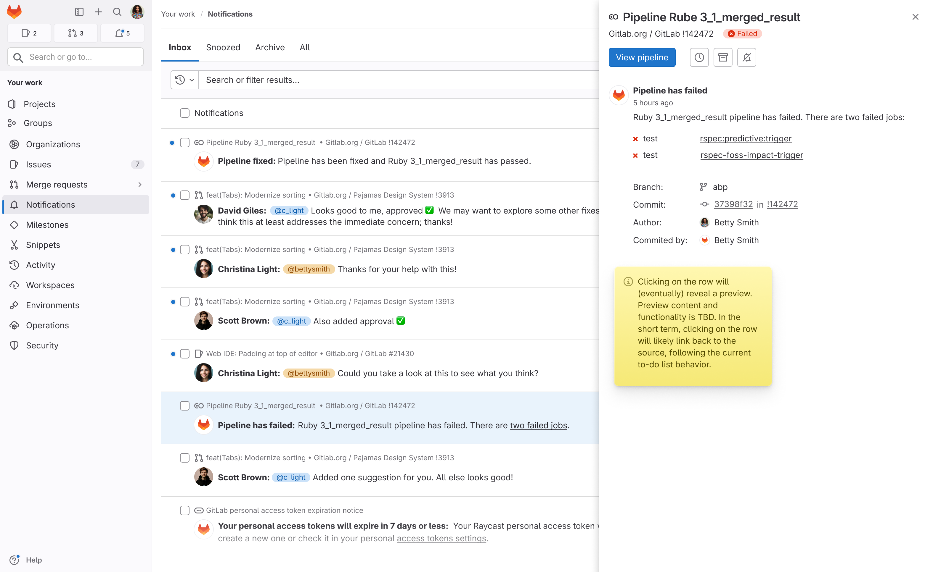
With this feedback in hand, I started exploring what higher-fidelity versions of my wireframes might look like. These higher-fidelity designs outlined the kind of functionality we hoped the new notification center might have in order to be useful (and usable) for our customers. Here are a couple of sample designs:


Once we had the full workflow described in higher-fidelity designs, I ran another round of research. In this research we first took a step back to see what people's expectations around notifications within GitLab were, and then shared our designs to see if what we were imagining would meet their needs. Thankfully, most people felt like what what they were seeing was a step in the right direction, so we felt more confident in our approach, and in moving forward in this direction.
We're currently working with our engineering team to figure out how to re-make the existing To-Do List into the notification center we're imagining.
As with all things, this discussion is much more complex than it might first appear, as the UI we are anticipating building isn't that complicated. What is complicated, though, is figuring out the architectural underpinnings of this new system.
The email notification system and the UI notification system are currently complete separate, and there is no parity between them, in terms of the notifications people can receive in each. So one question we're trying to answer is whether we should do the up front work of consolidating the two systems, or if we should leave them separate but go in and make sure the UI notification system contains equivalent notifications to the email notification system.
There are pros and cons to both approaches. The first requires considerable up-front effort, but will ultimately allow the notification system to be quickly updatable. The latter is sort of pushing the longer-term problem of consolidating the systems to the future, but it allows us to make immediate small iterations to the current notification UI list. For a small team with limited resources, these are the kinds of questions we need to resolve before we can move forward.
With that in mind, we're working on trying to improve the current To-Do List experience so that it's robust enough to handle more notifications. We're also looking into how to include the UI notifications as part of the current notifications settings page, so that people can have more control over what notifications appear in the UI. As part of this work, our excellent UX researcher is also trying to define a baseline experience metric, so we can track how the changes we're making to the experience are impacting people's perception of the feature, over time.
There's much work left to be done, then. I will update this case study with the results of our efforts when we start building these features, and introducing them to the public.