Case 4
Information architecture
Case 4
Information architecture
Though from awhile ago, this case still reflects my approach to diving into design problems: I favor looking into issues as thoughtfully as I can, and maintaining a close tie to the users who my decisions will affect throughout the process.
Mede/Analytics built an engineering tool to help automate the process of on-boarding new clients onto its software platform. The tool was originally only used by engineers and had a limited set of use cases. But, as the tool grew and different user groups were added, we started to notice a number of navigational issues creeping up. We needed to explore whether or not the existing navigation needed an upgrade.
The tool in question, called the Client Builder, is complicated and contains a lot of language that could potentially be confusing to non-engineers. But, since it had been in use for over a year, it also had a number of experienced users who could help us understand how they were currently using the tool.
My first step in tackling the navigational issues was thus to check in with users, both old and new. I wanted to understand how existing users thought about the different objects within the Client Builder, and to isolate areas of confusion for newer users.
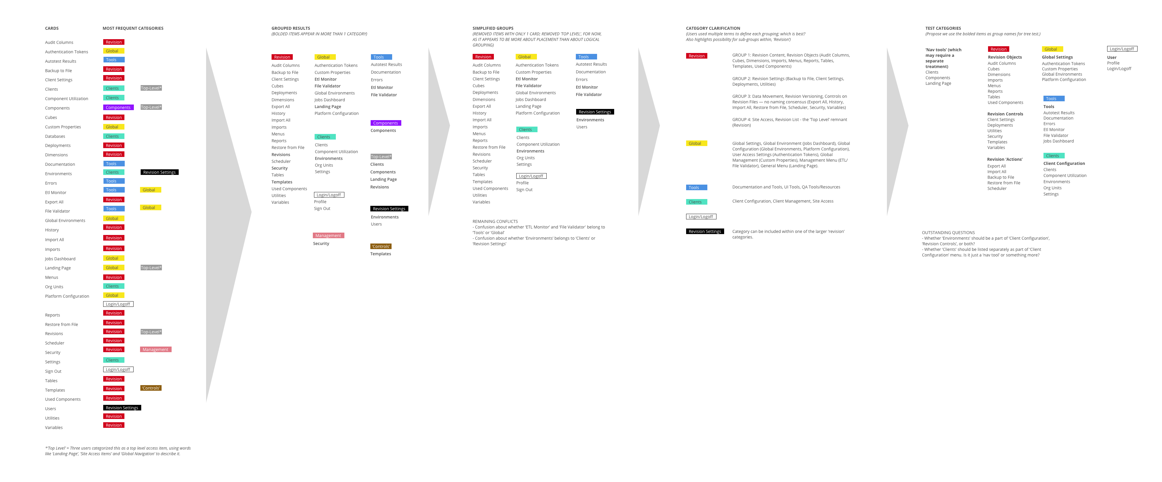
To achieve these goals, I conducted a card sorting exercise, which allowed users to group objects from the Client Builder in a way that makes sense to them. I used Optimal Workshop's Card Sort for this task:

The card sorting exercise showed some overlap in the way users thought about objects within the Client Builder (mapped groups directly below), but it also highlighted the fact that a lot of users weren't sure how to talk about the groups of objects that were formed. What should they be called?

To answer this question, I put together a TreeJack test. A TreeJack test traditionally shows a hypothetical navigation to users and asks them to complete a series of tasks using that navigation. I took the groups of objects that resulted from the Card Sort, gave them names, and then asked users to find objects within the groups. If they could successfully complete the tasks, the groups and group names probably made sense to our users. If they couldn't, I would need to revise.
The TreeJack test revealed fascinating tidbits of information about our users, in part because it not only tracked whether or not the users were successful at completing the task at hand, but it also kept record of the 'directness' of their path. So, if it took a user four clicks to find the right path, we probably needed to review our placement of the object.
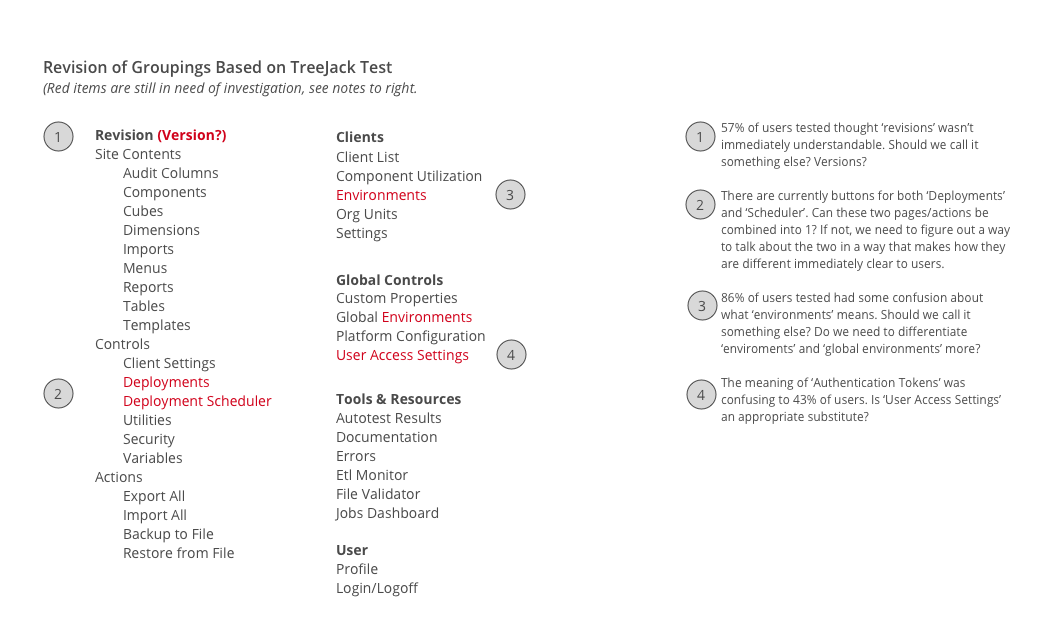
The TreeJack test also offered me the chance to ask follow up questions, which revealed surprising insights. For instance, I learned that some of the 'building block' terms we had been using for the Client Builder, terms that we knew were confusing but used because they were technically accurate, didn't even make sense to a majority (86%) of the users tested. An opportunity for improvement, for sure!
At any rate, post-TreeJack test, I put together a final list of object groupings and group titles that was much simpler than the previous version. I also highlighted a few remaining areas for investigation:

I mapped the object categories and groupings from my TreeJack test back to the current Client Builder UI. As there were numerous items we could improve on in the existing navigation and as I still had a few items I wanted to explore, I put together a quick Invision prototype to check my ideas with users.
I was surprised to find that, even with a small number of users, consensus quickly formed around the items that needed improvement, again reminding me of the value of checking in with users early & often.
After running my user tests and improving areas of my design, I put together a draft of my proposed navigation improvements. My design is shown below.
